Topic3: Plotting and Data Visualization
Contents
Topic3: Plotting and Data Visualization#
So far I have shown a figures here and there as a way to understand what our functions are doing. We are now ready to look at making figures of all kinds for various applications.
import matplotlib.pyplot as plt  # this is our standard ploting package
import numpy as np
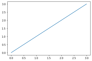
The most basic object you can imagine is just making a line. The way this is done is that we collect a bunch of (x,y) of the points along our curve as two lists / numpy arrays x_list, y_list:
x_list = [0,1,2,3]
y_list= [0,1,2,3]
plt.plot(x_list,y_list)
plt.show()
x_crazy = [1,3,0,2]
y_crazy = [2,1,0,3]
plt.plot(x_crazy,y_crazy)
plt.show()
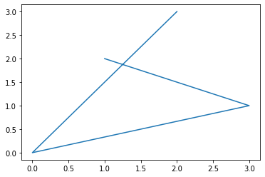
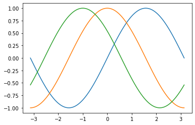
Seems simple enough. We can plot any of your favorite functions pretty easily this way:
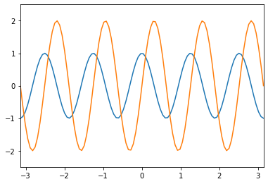
x=np.linspace(-np.pi,np.pi,100)
plt.plot(x,np.sin(x))
plt.plot(x,np.cos(x))
plt.plot(x,np.cos(x+1))
plt.show()
plt.plot(x,np.cosh(x))
plt.plot(x,np.sinh(x))
plt.show()

plt.plot(x,np.cosh(x))
plt.plot(x,np.sinh(x))
plt.savefig('test.pdf')
plt.show()
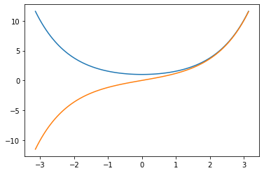
Figure and Axes#
The above figures illustrate the most basic functionality of pypolt: we feed in two lists or arrays of the same length and it can figure out that it is a figure. It is making a lot of choices automatically, but if we just want to see the lines, this is okay. However, in practice, we also want to be able to make nice figures that show what we want in the way we want. To do that, we will need to learn a lot more about pyplot.
For many advanced applications, we will need to used the Axes object. It is not always necessary, but most examples of cool plotting tricks use Axes and it will be hard to do those things on your own if you aren’t already comfortable with it. Let us start by making a basic figure but using some more advanced tools.
fig=plt.figure(figsize=(6,4))
left,bottom,width,height=0.1,0.1,0.8,0.8
ax=fig.add_axes((left,bottom,width,height))
This is just an empty plot. But this is the starting point. There are other ways to get here:
fig2,ax2=plt.subplots()
You might wonder why it is called “subplots”. The reason is that I would call the same thing if I wanted many different panels inside one figure:
fig3,ax3=plt.subplots(figsize=(12,6),nrows=2,ncols=3)
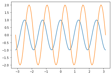
Now let’s start adding some lines to our figure:
fig=plt.figure(figsize=(6,4))
left,bottom,width,height=0.1,0.1,0.8,0.8
ax=fig.add_axes((left,bottom,width,height))
ax.plot(x,np.cos(5*x))
ax.plot(x,2*np.sin(5*x))
plt.show()
The first thing we might want to do is to place the limits on the x-axis so that there aren’t the weird empty areas to the left and right of the line.
fig=plt.figure(figsize=(6,4))
left,bottom,width,height=0.1,0.1,0.8,0.8
ax=fig.add_axes((left,bottom,width,height))
ax.plot(x,np.cos(5*x))
ax.plot(x,2*np.sin(5*x))
ax.set_xlim(-np.pi,np.pi) # sets the x-axis range
ax.set_ylim(-2.5,2.5) # sets the y-axis range
plt.show()
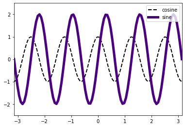
Now we might want to make the lines look different: we can change the line width, the line style, the color and opacity
fig=plt.figure(figsize=(6,4))
left,bottom,width,height=0.1,0.1,0.8,0.8
ax=fig.add_axes((left,bottom,width,height))
ax.plot(x,np.cos(5*x),lw=2,ls='--',color='black',label='cosine') # ls = line style
ax.plot(x,2*np.sin(5*x),lw=5,color='indigo',label='sine') # lw =line width
ax.set_xlim(-np.pi,np.pi) # sets the x-axis range
ax.set_ylim(-2.5,2.5) # sets the y-axis range
ax.legend() # makes a legend using labels of the lines
plt.show()
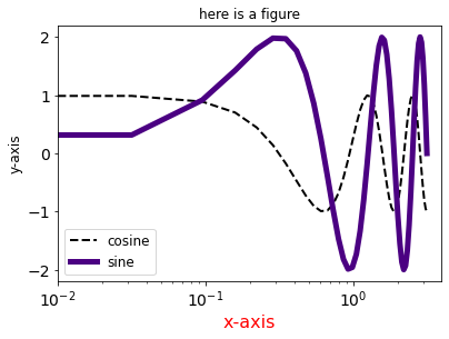
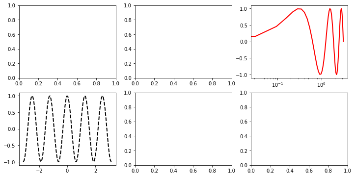
Lastly we will want to change the axes, tick marks and/or labels:
fig=plt.figure(figsize=(6,4))
left,bottom,width,height=0.1,0.1,0.8,0.8
ax=fig.add_axes((left,bottom,width,height))
ax.plot(x,np.cos(5*x),lw=2,ls='--',color='black',label='cosine') # ls = line style
ax.plot(x,2*np.sin(5*x),lw=5,color='indigo',label='sine')

ax.set_xscale('log')
ax.set_xticks([0.01,0.1,1.])
ax.set_yticks([-2,-1,0,1,2])


ax.set_ylabel("y-axis",fontsize=12)
ax.set_xlabel("x-axis",fontsize=16,color='red')
ax.set_title("here is a figure")

ax.tick_params(axis='both', which='major', labelsize=14)

ax.legend(fontsize=12,loc='lower left') # makes a legend using labels of the lines
plt.show()
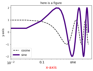
fig=plt.figure(figsize=(6,4))
left,bottom,width,height=0.1,0.1,0.8,0.8
ax=fig.add_axes((left,bottom,width,height))
ax.plot(x,np.cos(5*x),lw=2,ls='--',color='black',label='cosine') # ls = line style
ax.plot(x,2*np.sin(5*x),lw=5,color='indigo',label='sine')

ax.set_xscale('log')
ax.set_xticks([0.01,0.1,1.])
ax.set_yticks([-2,-1,0,1,2])


ax.set_ylabel("y-axis",fontsize=12)
ax.set_xlabel("x-axis",fontsize=16,color='red')
ax.set_title("here is a figure")

ax.set_xticklabels(['$10^{-2}$','0.1','one'],fontsize=14)

ax.legend(fontsize=12,loc='lower left') # makes a legend using labels of the lines
plt.show()
Hopefully you get the idea. You have a lot of control over the figure. It is also easy to generalize this to multi-panel figures as follows:
fig3,ax3=plt.subplots(figsize=(12,6),nrows=2,ncols=3)

ax3[1,0].plot(x,np.cos(5*x),lw=2,ls='--',color='black',label='cosine')

ax3[0,2].plot(x,np.sin(5*x),lw=2,color='red',label='cosine')
ax3[0,2].set_xscale('log')
Histograms, scatter plots, heat maps and more#
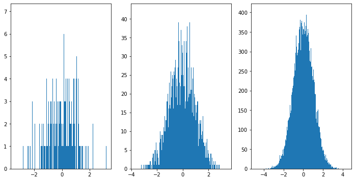
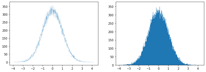
A histogram is a pretty useful way to plot a bunch of numbers. Ie if we measure something a lot of times and we want to know how often it falls into a given range, we can make a histogram. The easiest way to do it is just to tell it how many bins you want and it will automatically decide how to group your data into that number of bins:
fig_h,ax_h=plt.subplots(figsize=(12,6),ncols=3)
for i in range(3):
    x=np.random.randn(10**(i+3))
    ax_h[i].hist(x,bins=1000)
plt.show()
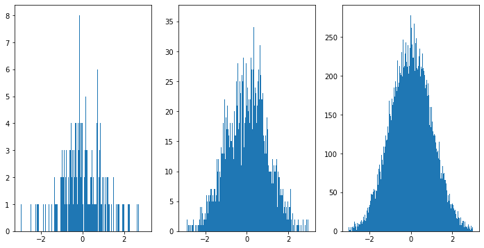
We can also give ourselves a bit more control of the bins as follows:
fig_h,ax_h=plt.subplots(figsize=(12,6),ncols=3)
for i in range(3):
    x=np.random.randn(10**(i+3))
    ax_h[i].hist(x,bins=np.linspace(-3,3,1000))
plt.show()
We can get the data that would make a histrogram using numpy:
x=np.random.randn(10**(4))
np.histogram(x,bins=100)
(array([  3,   1,   1,   0,   2,   2,   3,   2,   8,   7,   5,   7,   7,
         10,  11,  18,  10,  20,  31,  22,  32,  34,  39,  36,  60,  76,
         87,  88, 103, 109,  99, 131, 151, 158, 162, 189, 189, 212, 247,
        235, 250, 261, 269, 260, 298, 321, 255, 302, 300, 297, 299, 306,
        291, 309, 275, 272, 247, 246, 219, 224, 207, 178, 178, 161, 141,
        114, 129,  90, 109,  77,  71,  59,  52,  46,  34,  44,  28,  29,
         24,  19,  15,  21,  10,   8,   7,   9,   4,  11,   3,   5,   3,
          0,   1,   1,   0,   1,   1,   0,   1,   1]),
 array([-3.65903674, -3.58388574, -3.50873474, -3.43358374, -3.35843274,
        -3.28328174, -3.20813073, -3.13297973, -3.05782873, -2.98267773,
        -2.90752673, -2.83237573, -2.75722473, -2.68207372, -2.60692272,
        -2.53177172, -2.45662072, -2.38146972, -2.30631872, -2.23116772,
        -2.15601671, -2.08086571, -2.00571471, -1.93056371, -1.85541271,
        -1.78026171, -1.7051107 , -1.6299597 , -1.5548087 , -1.4796577 ,
        -1.4045067 , -1.3293557 , -1.2542047 , -1.17905369, -1.10390269,
        -1.02875169, -0.95360069, -0.87844969, -0.80329869, -0.72814768,
        -0.65299668, -0.57784568, -0.50269468, -0.42754368, -0.35239268,
        -0.27724168, -0.20209067, -0.12693967, -0.05178867,  0.02336233,
         0.09851333,  0.17366433,  0.24881534,  0.32396634,  0.39911734,
         0.47426834,  0.54941934,  0.62457034,  0.69972134,  0.77487235,
         0.85002335,  0.92517435,  1.00032535,  1.07547635,  1.15062735,
         1.22577836,  1.30092936,  1.37608036,  1.45123136,  1.52638236,
         1.60153336,  1.67668436,  1.75183537,  1.82698637,  1.90213737,
         1.97728837,  2.05243937,  2.12759037,  2.20274138,  2.27789238,
         2.35304338,  2.42819438,  2.50334538,  2.57849638,  2.65364738,
         2.72879839,  2.80394939,  2.87910039,  2.95425139,  3.02940239,
         3.10455339,  3.1797044 ,  3.2548554 ,  3.3300064 ,  3.4051574 ,
         3.4803084 ,  3.5554594 ,  3.6306104 ,  3.70576141,  3.78091241,
         3.85606341]))
We see that histogram actually output two different arrays, so we want to save both
x=np.random.randn(10**(5))
hist_data,hist_bins=np.histogram(x,bins=1000)
This data isn’t quite what we want, as the bins are labeled by the edges of each range, but we want to plot it in the middle. This we can see by comparing the lengths
print(len(hist_bins),len(hist_data))
1001 1000
This is solved by making an array of the middle points:
bin_cent=np.zeros(len(hist_data))
for i in range(len(hist_data)):
    bin_cent[i]=(hist_bins[i]+hist_bins[i+1])/2
Now we can make similar looking figures, either with our old “plot” or using a bar plot:
fig2,ax2=plt.subplots(ncols=2,figsize=(12,4))
ax2[0].plot(bin_cent,hist_data)
ax2[1].bar(bin_cent,hist_data)
<BarContainer object of 1000 artists>
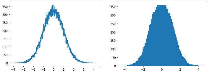
We can see by eye that something is wrong with our bar plot. It clearly didn’t just plot the data. The problem is just that the default size of the bars on a bar plot are too wide (and similarly for the default linewidth on plot). We can just make the bars more narrow and it will look right again:
fig2,ax2=plt.subplots(ncols=2,figsize=(12,4))
ax2[0].plot(bin_cent,hist_data,lw=0.2)
ax2[1].bar(bin_cent,hist_data,width=0.01)
plt.show()
Sometimes you will also want to plot points and not lines, in which case “scatter” is a big better than “plot”
fig2,ax2=plt.subplots(ncols=3,figsize=(15,4))
x=np.random.randn(10**(3))
y=np.random.randn(10**(3))
size=10*np.random.randn(10**(3))**2
colors=np.random.randn(10**(3))
ax2[0].scatter(x,y)
ax2[1].scatter(x,y,s=size)
ax2[2].scatter(x,y,s=size,c=colors,cmap='coolwarm')
plt.show()
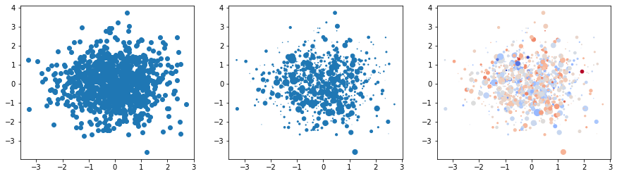
In the last version, we see the first example of a “cmap”: this is a conversion from a set of numbers to a set of colors.
### This is a copy of a function I found at https://matplotlib.org/stable/tutorials/colors/colormaps.html

cmaps = {}

gradient = np.linspace(-1, 1, 356)
gradient = np.vstack((gradient, gradient))


def plot_color_gradients(category, cmap_list):
    # Create figure and adjust figure height to number of colormaps
    nrows = len(cmap_list)
    figh = 0.35 + 0.15 + (nrows + (nrows - 1) * 0.1) * 0.22
    fig, axs = plt.subplots(nrows=nrows + 1, figsize=(6.4, figh))
    fig.subplots_adjust(top=1 - 0.35 / figh, bottom=0.15 / figh,
                        left=0.2, right=0.99)
    axs[0].set_title(f'{category} colormaps', fontsize=14)

    for ax, name in zip(axs, cmap_list):
        ax.imshow(gradient, aspect='auto', cmap=plt.get_cmap(name))
        ax.text(-0.01, 0.5, name, va='center', ha='right', fontsize=10,
                transform=ax.transAxes)

    # Turn off *all* ticks & spines, not just the ones with colormaps.
    for ax in axs:
        ax.set_axis_off()

    # Save colormap list for later.
    cmaps[category] = cmap_list
plot_color_gradients('Diverging',
                     ['PiYG', 'PRGn', 'BrBG', 'PuOr', 'RdGy', 'RdBu', 'RdYlBu',
                      'RdYlGn', 'Spectral', 'coolwarm', 'bwr', 'seismic'])
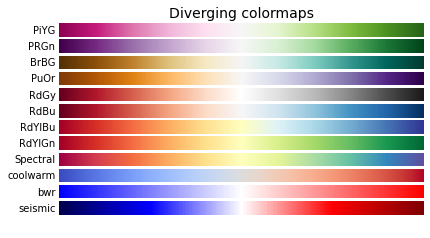
These are just some of the examples. There are plenty of color maps to choose from.
Perhaps the more common use of the cmpa is in making heatmap plots. This is a common visualization of 3 dimensional data:
x=y=np.linspace(-3,3,100)
X,Y=np.meshgrid(x,y)
Z=np.exp(-0.1*X**2-0.1*(Y)**2)*np.cos(2*X**2)*np.sin(Y)
z_min, z_max = -np.abs(Z).max(), np.abs(Z).max()
fig2,ax2=plt.subplots(ncols=3,figsize=(15,4))
ax2[0].pcolor(X,Y,Z,cmap='RdBu', vmin=z_min, vmax=z_max,shading='auto')
ax2[1].contour(X,Y,Z,cmap='RdBu')
ax2[2].contourf(X,Y,Z,cmap='RdBu')
plt.show()
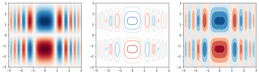
pcolor complained a lot more qhen I made the plot. Online tutorials often seem to show needed to include the color range and shading manualled. The contour plots seems to work with less input, but do not include the same level of detail.
3d figures#
We can make heat maps for 3d data, but we might also want to visualize it in 3d
fig = plt.figure()
ax = plt.axes(projection='3d')
ax.contour3D(X, Y, Z, 50, cmap='binary')
ax.set_xlabel('x')
ax.set_ylabel('y')
ax.set_zlabel('z')
Text(0.5, 0, 'z')
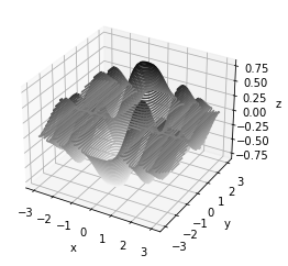
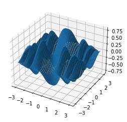
fig = plt.figure()
ax = plt.axes(projection='3d')
ax.plot_surface(X,Y,Z)
<mpl_toolkits.mplot3d.art3d.Poly3DCollection at 0x1263d1f70>
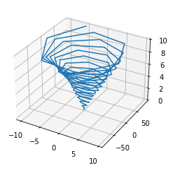
zline=np.linspace(0,10,100)
xline=zline*np.sin(10*zline)
yline=zline**2*np.cos(10*zline)
fig = plt.figure()
ax = plt.axes(projection='3d')
ax.plot3D(xline,yline,zline)
[<mpl_toolkits.mplot3d.art3d.Line3D at 0x12647a190>]
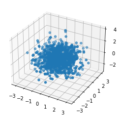
xdata=np.random.randn(10**(3))
ydata=np.random.randn(10**(3))
zdata=np.random.randn(10**(3))
fig = plt.figure()
ax = plt.axes(projection='3d')
ax.scatter3D(xdata,ydata,zdata)
<mpl_toolkits.mplot3d.art3d.Path3DCollection at 0x1268c0340>
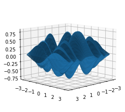
For 3d figures, one things that is often needed is to rotate the point of view. This can be achieved using ax.view_init(theta,phi) where theta is the angle above the x-y plane and phi is the rotation around the z-axis:
fig = plt.figure()
ax = plt.axes(projection='3d')
ax.plot_surface(X,Y,Z)
ax.view_init(0,10)
plt.show()
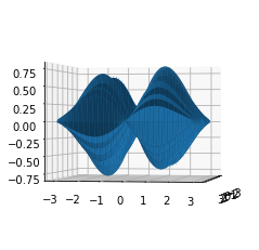
fig = plt.figure()
ax = plt.axes(projection='3d')
ax.plot_surface(X,Y,Z)
ax.view_init(10,0)
plt.show()
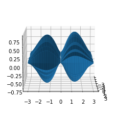
fig = plt.figure()
ax = plt.axes(projection='3d')
ax.plot_surface(X,Y,Z)
ax.view_init(10,45)
plt.show()
Summary#
Python has nearly infinite flexibility to make figures of all kinds. The basics are fairly easy to use. Making sharp visual representations of information is an invaluable skill and learning the advanced python plotting techniques will enhance your ability to convey ideas. The best way is to look at examples that you like that have source code and then try to understand what they did by also reading the API. Over time this will make it easier for you to just read the API directly to find new features you might want to try.